Physical Address
304 North Cardinal St.
Dorchester Center, MA 02124
Physical Address
304 North Cardinal St.
Dorchester Center, MA 02124

Have you ever thought that the colors used on your website have great impact on your overall product sales and conversion rate. We see colors everyday, everywhere and they are one among the important factors which helps us to make decisions. And today we will discuss about the 10 marketing colors that increase sales and the we will also discuss why it happens.

Color theory is an important dimension of design and art. After all, we like things that look nice, and color (or even lack of color) is a vessel towards making something visually impressive. Aside from only making things look beautiful, color takes on additional roles when you are crafting a logo, creating graphics for an advertisement, choosing a color scheme for a company website or mobile app and numerous other design-related business strategies.
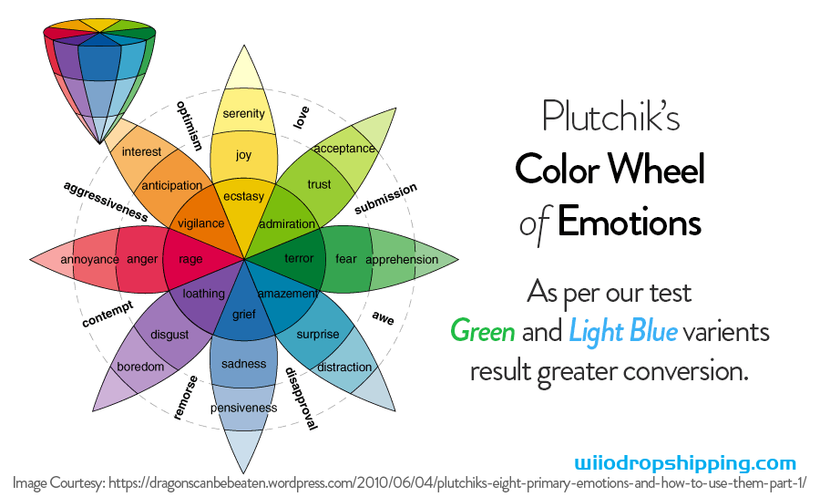
Colors can evoke powerful emotional responses from viewers; they can even subtly influence those viewers to act or feel a certain way. From a sales perspective, this is a powerful motivator to start injecting color theory into marketing messages and other efforts. Marketers and business owners should start their education in color theory with Plutchik’s Color Wheel of Emotions.

Robert Plutchik first theorized his color wheel in 1980 as a means to connect colors to what he believed were the eight key emotions. Similar to how a traditional color wheel puts complementary colors opposite of one another, Plutchik’s wheel puts contrasting emotions across from each other (fear vs. anger, joy vs. sadness and so on). He further divided each color and emotion into varying degrees, based on the hue or shade.
While this is a good place to start, with regards to color theory, it is important to note that Plutchik’s wheel isn’t law. Not all of his emotion-color relationships are entirely complete or accurate. For example, red is commonly associated with anger and rage, as he suggests, but it is also used to demonstrate strength and power.
Thus, we’ll delve deeper into Plutchik’s wheel of emotions and use it as a jumping off point to determine the ten colors that increase sales and analyze why they are effective at doing so.
We might as well start with red because it is one of the colors that Plutchik misses the mark the most on, at least regarding colors that drive sales. He isn’t wrong by suggesting that red suggests rage, anger, and annoyance, but it is also commonly associated with strength, power, and dignity. It is one of the most popular colors in marketing messages for these reasons.
These are powerful motivators for increasing sales for a number of reasons. Most visible, consumers want to align themselves with powerful, strong brands because this suggests that they make the best products or offer the best services. Secondly, red also has an air of patriotism to it, especially in America. This leads to customers feeling a sense of belonging, by committing their loyalty to brands that incorporate red into their logo and themes. Additionally, it helps convert because potential leads don’t want to be excluded; the fear of missing out is a powerful influencer.
As much as we don’t want to anger or annoy our customers, these aren’t entirely bad emotions to create. Why? Because anger, rage, and annoyance almost always result in a reaction. When we are angry, we lash out. If you can direct that anger to a competitor or a problem you are hoping to solve, it can be incredibly impactful.
Following Plutchik’s wheel clockwise, the next color we land on is orange. Landing itself between red and yellow, orange is a blend between the high-heat, excitement of red and the calming influence of yellow (we’ll get to that next). Thus, it makes sense for orange to produce feelings of anticipation, eagerness, and interest. Orange excites consumers, while simultaneously hinting that there is a wait for the subject of that excitement.
This means orange is very powerful when trying to build hype about an upcoming product or announcement. You can subtly increase this hype with deeper oranges or a red-orange shade. For example, when an event is weeks or months away, you can use a soft, pastel orange. The next time you mention the same event, the orange gets a little darker. Then, right before the event occurs, you move towards a red-orange. This shifts the emotional response away from the calmness that allows for waiting and closer towards the excitement that ultimately leads to action at the date of the event.
Companies that incorporate orange into their logo or themes suggest a brand that is engaging, even fun. It’s an excellent color to use if you are in a very competitive market. Discover Card uses it to stand out amongst the many other credit cards, just as ING uses orange to set themselves apart from every other insurance company. This fun and interesting response to orange also makes it useful for companies that aren’t in the most exciting or glamorous industry.
As we’ve touched on briefly, yellow is known for having a calming effect, especially when it is used in softer tones. The deeper the yellow, it begins to drift away from this feeling of serenity and more towards happiness, joy and, at the most extreme levels, ecstasy. Thus, yellow is a very versatile color for increasing sales.
Obviously, we want to keep our customers happy. When people are happy, they are more likely to have a positive outlook on your brand and therefore buy its products. This also helps encourage them to become a brand-loyal ambassador that spreads the word about your company and its offerings to their friends and family members.
Yellow is especially advantageous during times of crisis when your reputation may be tarnished or at risk of becoming irreparably damaged. Yellow calms potential unrest and re-establishes your company as a positive, happy force in the industry. It helps turn potential anger back into happiness. The popular app Snapchat uses the color yellow in their brand. So if you’re deciding on some colors for your next app consider this happy color. Many app makers allow you to build your own app and incorporate any color into it.
The last thing to consider about yellow is its proximity to the color gold, which directly translates to thoughts of wealth, money, and status. Brands like Rolex and American Express use gold as their primary color and are both symbols of status and money. Even if you aren’t a luxury brand, using the color gold can persuade customers to think your brand is of a higher echelon. Alternatively, gold can convince potential customers that your services will lead them to wealth and status.
Similar to yellow, green is an incredibly versatile color, in terms of what emotions and feelings it triggers. Plutchik suggested that lighter greens lend a hand towards trust and acceptance, while darker greens relate to fear and terror. That’s quite the spectrum! For brands, green also suggests wealth (the color of money, after all) and environmental awareness.
Let’s start with the trust and acceptance qualities of green. Similar to red and its patriotism, these emotions encourage people to participate or buy because it will mean belonging to the team. Whereas red achieves this with power and dignity, the contrasting color of green gets there with an approachable friendliness.
According to Plutchik, very dark shades of green replace this warm approachableness with the complete opposite: fear. This is another case where his color wheel of emotions isn’t entirely accurate. For marketing and sales, dark green is most closely associated with money and wealth because it is the color of dollar bills. The closest to fear and terror that green gets is its association with jealousy and thereby the fear of not being wealthy or adequate enough.
Consumers are increasingly looking at brands that have a dedication to environmentally friendly practices and reducing their carbon footprint. One of the most effective ways to demonstrate a green company is, as you may expect, using the color green.
Green also demonstrates health and well-being, which means it is useful if your company is trying to bounce back from a bad quarter or a bad reputation. It says we’re back and we are doing well again. It can help influence old, defected customers to return and give your brand another chance.
Another very versatile color, blue has a lot of uses, and it invokes many different emotions. A deep, dark blue can stir up sadness and grief, while a light blue can keep people calm (similar to yellow), cool and refreshed. A true blue, or middle of the spectrum blue, lends a hand towards demonstrating honest and trustworthy qualities.
Blue is also notable because it is the most popular choice for a favorite color, which means anything blue is liked by the majority of people who are going to see it. Similar to red, blue suggests patriotism and develops a sense of belonging and cohesion for customers. It also pairs well with a lot of other colors, which makes it not only emotionally versatile but also very diverse in how it can be used in terms of design.
You may notice that the color blue is used in a lot of tech companies, especially in the design of their logos. This isn’t a coincidence, as blue is also said to demonstrate intelligence and connectivity. It’s almost like the unofficial color of the Internet. A number top app makers use blue, as well as many technology companies (HP, Dell, Intel, IBM).
Pink used to be a one trick pony. It was almost exclusively used in companies looking to attract an all-female audience. Cosmopolitan, Women’s Health Magazine, Barbie, Victoria’s Secret PINK: these are all brands that cater to women and have long used pink as their color of choice because it has always been associated with the female gender. For companies that were trying to attract men, pink was seen as too dainty and not masculine enough.
In today’s ever-evolving world where gender neutrality is becoming a hot topic, in particular among the younger, millennial generation, pink is no longer so one dimensional. While it is still a powerful attractor to female audiences, especially to teens and young women, it is taking on new roles and could evolve to become a very attractive business color for increasing sales.
Where audiences once saw it as dainty, pink now denotes a particular kind of simplicity and no-hassle. This quality is why big tech brands like T-Mobile and LG use pink in their logos. It helps attract customers by subtly promising a smooth, care-free experience. T-Mobile, for example, has to contend with the fierce, bold red of Verizon and deep intellectual and sophisticated blue of AT&T. Their extensive use of pink helps showcase that they don’t have a big enterprise feel like Verizon or the complexness of AT&T, which has allowed them to attract defectors from these brands.
The biggest qualities associated with black are luxury, elegance, style and boldness. Almost every high-end brand uses black in their logo design: Louis Vuitton, Prada, Cartier, Chanel, Mercedes-Benz, Ralph Lauren and the list goes on and on. If you are trying to cater to an upscale clientele, black is almost always the way to go.
The other characteristic that black demonstrates is mystery. Black is the unknown. A lot of car companies and alcohol brands use black to demonstrate boldness and luxury, but also because their products are very experience driven. We want to experience what it’s like to drive the new Mercedes-Benz or experience the taste of Johnny Walker. This mystery drives curiosity and ultimately pushes consumers to test the product for themselves.
Black is also used as a non-dominant color in many designs because of its crisp, clean look. Even a subtle black border can help add a level of seriousness to your logo or marketing message.
In the classic Herman Melville tale of Moby Dick, Melville spends a long chapter discussing the whiteness of the whale and how this color can create a mix of feelings. The most immediate feelings are things like purity, cleanliness, innocence, piety and so on. But, as Melville points out, white can also be dubious and mysterious, similar to black. A large white space can be calming, but worrisome at the same time because there is a fear of the unknown.
Just like black, white is used in a ton of different logos as a complementary element. White can really help a logo or advertisement pop. It creates an effective outline, clean lines and helps give their graphics or advertisements some neutral, white space. This neutral space is a big part of design. You don’t want to overload the viewer with too many graphics and colors. White space gives the viewer a place to rest their eye and helps prevent them from being overwhelmed.
Because of its common associations with purity and cleanliness, white is used a lot in brands focused on cleaning supplies or hygiene. Popular brands that use white as a primary brand color: Clorox, Dove, Swiffer Colgate. Black and white together are the most common color combination and achieves a simple, yet clean and sophisticated look.
Understanding color theory is essential to getting the most out of your design and marketing efforts. Everything you do as a company has an objective or goal behind it; something you are trying to motivate your customers to do or feel. By using the right colors, you can significantly enhance your ability to achieve these objectives and thereby improve your bottom line.